July 1, 2024
July 1, 2024
FIGENTA
FIGENTA
FIGENTA
A product experience case study demonstrating trading-style UI, analytical dashboards, real-time DeFi data, and multi-chain financial flows.
A product experience case study demonstrating trading-style UI, analytical dashboards, real-time DeFi data, and multi-chain financial flows.
A product experience case study demonstrating trading-style UI, analytical dashboards, real-time DeFi data, and multi-chain financial flows.
Year
2024
Client
PRODUCT UI/UX DESIGNER
Category
SAAS
PROJECT OVERVIEW
PROJECT OVERVIEW
PROJECT OVERVIEW
Figenta is presented as the world’s first multi-cross-chain NFT payment system enabling users to purchase NFTs using thousands of tokens across multiple supported chains. The system extends beyond payments into a full DeFi ecosystem with:
A cross-chain analytics dashboard
Token price history
Staking pools
Mining pool data
Hub for multi-chain operations
Real-time APRs, TVL, and 24h volume
Liquidity charts
The design challenge revolved around translating deeply technical blockchain and DeFi mechanics into a clear, intuitive, analytical, accessible trading-style dashboard UI.
🎯 MY ROLE & CONTRIBUTION
🎯 MY ROLE & CONTRIBUTION
🎯 MY ROLE & CONTRIBUTION
Lead Product Designer (UX & UI)
Data Visualization & Dashboard Architecture
Interaction Design & Component System
Accessibility & Dark Mode Optimization
Mobile-first responsive design for DeFi features
This case study demonstrates hands-on experience in:
✓ Designing analytical dashboards
✓ Trading terminal–style UI patterns
✓ Visualizing real-time financial data
✓ Complex multi-chain data structures
✓ Secure financial flows & Web3 interactions
✓ DeFi UX for staking, liquidity, pools, APRs
🧩 Problem Statement
🧩 Problem Statement
🧩 Problem Statement
Users interacting with DeFi products face challenges:
Overwhelming Data Density
TVL, APR, staking metrics, liquidity, price trends — often scattered across multiple pages.
Fragmented Multi-Chain Experience
Switching between networks breaks the user flow and confuses beginners.
Poor Visualization of Real-Time Metrics
DeFi numbers change by the second; charts often lag or lack clarity.
NFT purchases restricted to single-chain tokens
Users want to buy NFTs with any token they hold — not just a narrow selection.

🎯 Design Goals
🎯 Design Goals
🎯 Design Goals
Based on the above challenges, I defined these objectives:
Unified Multi-Chain Dashboard
Bring data, pools, rewards, chain activity, tokenomics, and liquidity analytics into one place.
Trading-Terminal Clarity
Adopt visual patterns from crypto exchanges to help users understand complex information quickly.
Real-Time Visualization
Charts, TVL, APR, staking pools, and cross-chain activity had to update dynamically.
Accessible & Mobile-First
Even though the product is data-heavy, interfaces needed to remain accessible and legible across devices.
🛠️ Design Process
🛠️ Design Process
🛠️ Design Process
Research & Competitive Analysis
Benchmarked 12+ DeFi and trading platforms:
Binance Earn
Uniswap Analytics
PancakeSwap Pools
TradingView
Rainbow Wallet
Opensea
Noticed major gaps:
Lack of unified dashboards
Poor APR presentation
Inconsistent multi-chain flows
Information Architecture
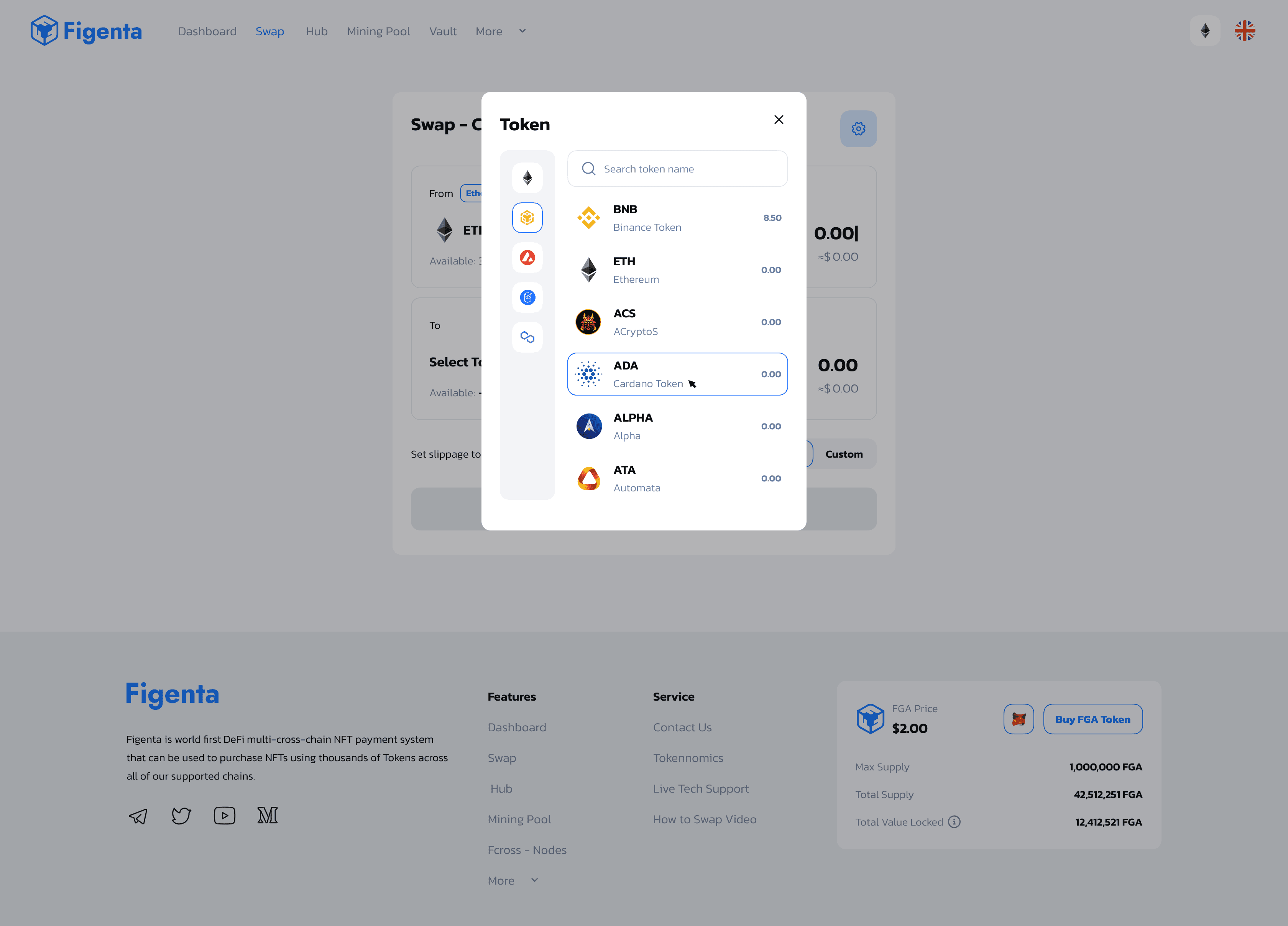
I structured Figenta’s IA into the following core surfaces:
Dashboard (central analytics hub)
Swap (multi-token exchange)
Hub (multi-cross-chain routing)
Mining Pool (staking + APR analytics)
Cross-Chain Pool Tables (TVL, APR, 24h volume)
Tokenomics (liquidity, supply, token price history)
The challenge was organizing high-density data into digestible sections.
Research & Competitive Analysis
Benchmarked 12+ DeFi and trading platforms:
Binance Earn
Uniswap Analytics
PancakeSwap Pools
TradingView
Rainbow Wallet
Opensea
Noticed major gaps:
Lack of unified dashboards
Poor APR presentation
Inconsistent multi-chain flows
Information Architecture
I structured Figenta’s IA into the following core surfaces:
Dashboard (central analytics hub)
Swap (multi-token exchange)
Hub (multi-cross-chain routing)
Mining Pool (staking + APR analytics)
Cross-Chain Pool Tables (TVL, APR, 24h volume)
Tokenomics (liquidity, supply, token price history)
The challenge was organizing high-density data into digestible sections.
📊 Key UX Solutions & Screens
📊 Key UX Solutions & Screens
📊 Key UX Solutions & Screens
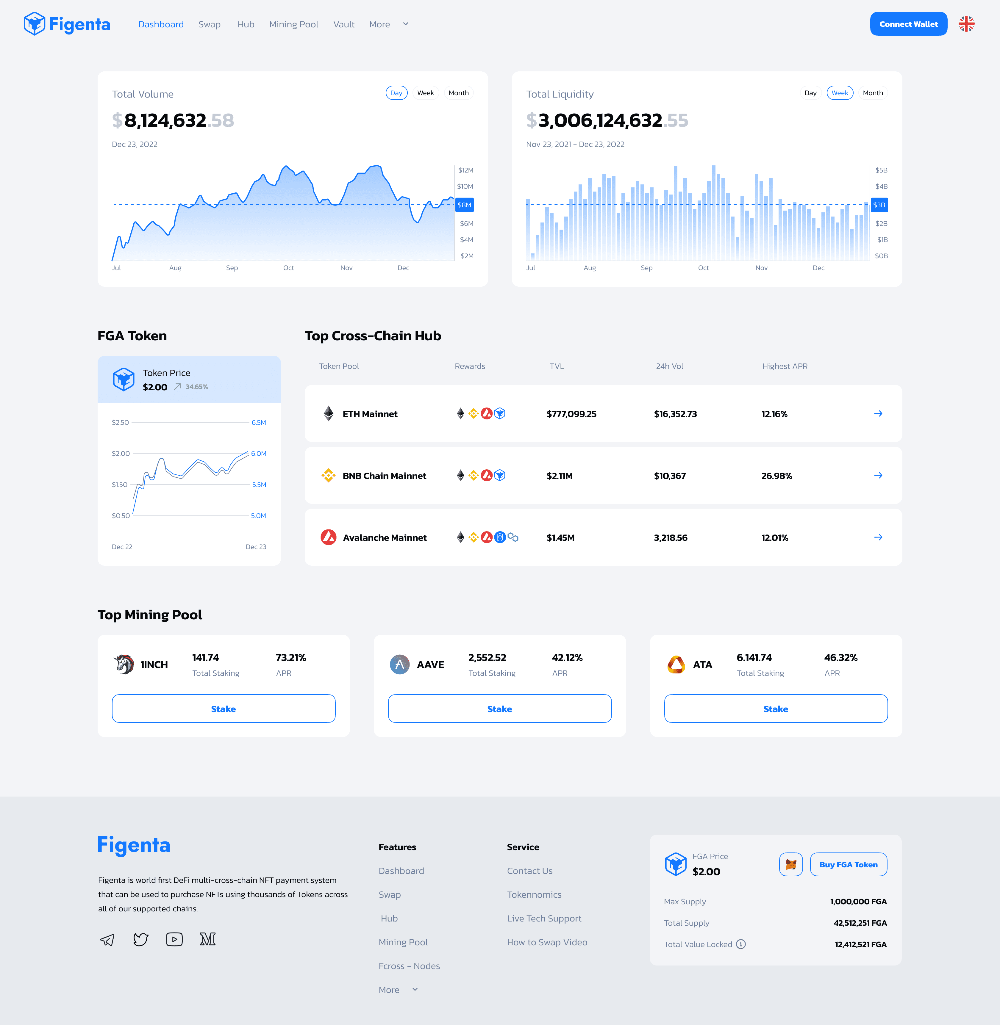
🖥️ 1. Unified Analytics Dashboard (Trading UI)
The dashboard combines TVL, price history, staking pools, multi-chain activity, and token statistics.
Data included:
FGA token price ($2.00)
Max supply, total supply, TVL
Liquidity charts ($3B+)
Volume charts ($8M+)
Design Decisions
Adopted a trading-terminal grid layout
Prioritized dark mode for clarity
Created interactive charts using a TradingView-style layout
Used consistent visual hierarchy for numerical data
📊 2. Liquidity & Volume Charts
Charts show data across Day / Week / Month / Year with clean axis scaling.
Design Features:
Smooth multi-period transitions
Candlestick-inspired line charts
Always-on hover tooltips
Clear value ranges (e.g., $0B–$5B)
📊 2. Liquidity & Volume Charts
Charts show data across Day / Week / Month / Year with clean axis scaling.
Design Features:
Smooth multi-period transitions
Candlestick-inspired line charts
Always-on hover tooltips
Clear value ranges (e.g., $0B–$5B)
📊 2. Liquidity & Volume Charts
Charts show data across Day / Week / Month / Year with clean axis scaling.
Design Features:
Smooth multi-period transitions
Candlestick-inspired line charts
Always-on hover tooltips
Clear value ranges (e.g., $0B–$5B)
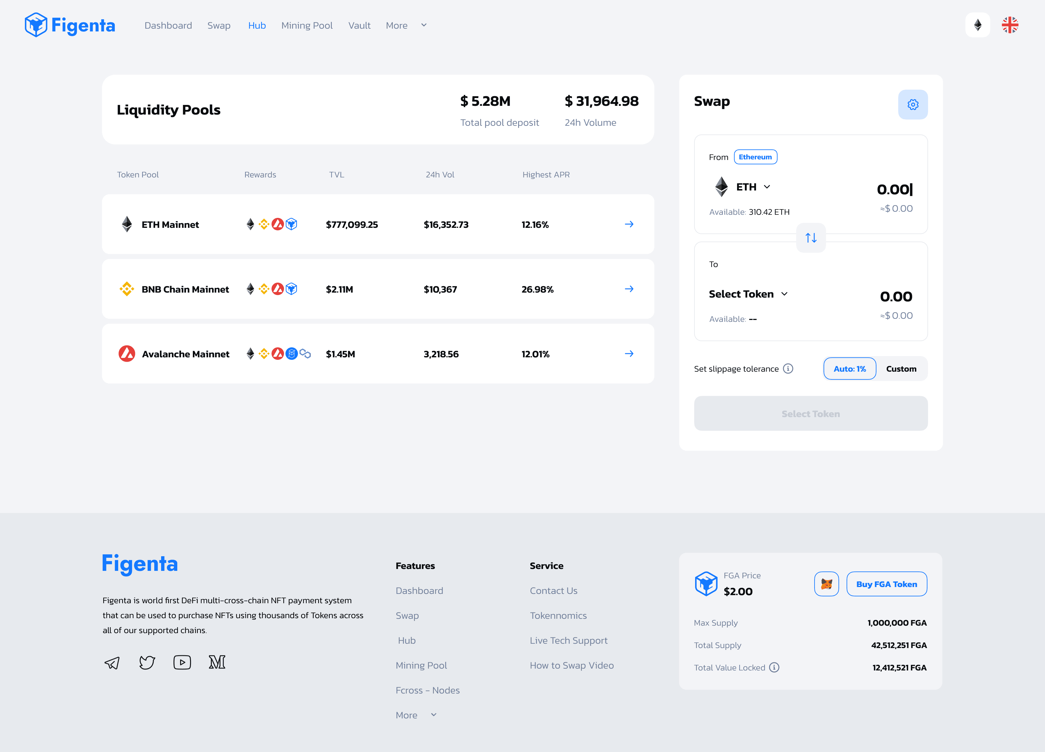
📈 3. Multi-Chain Pool Tables
Users compare chain performance across networks.
Metrics:
TVL
24h Volume
Highest APR
Network (ETH Mainnet, BNB, Avalanche)
UX Approach:
Tables optimized for sorting
Highlighted highest APR using color-coded badges
Clear row spacing to reduce cognitive load
Sticky headers for long scrolling
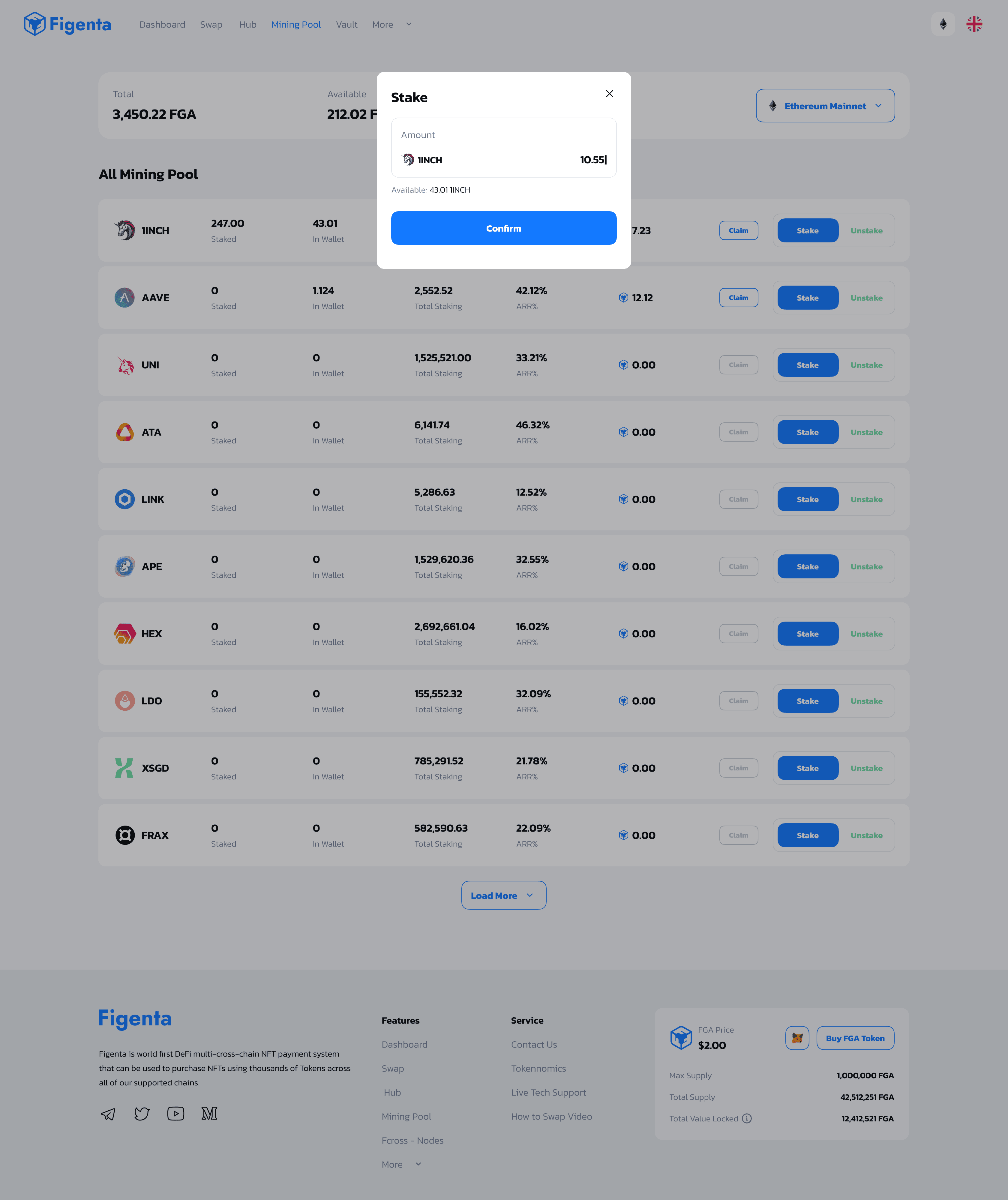
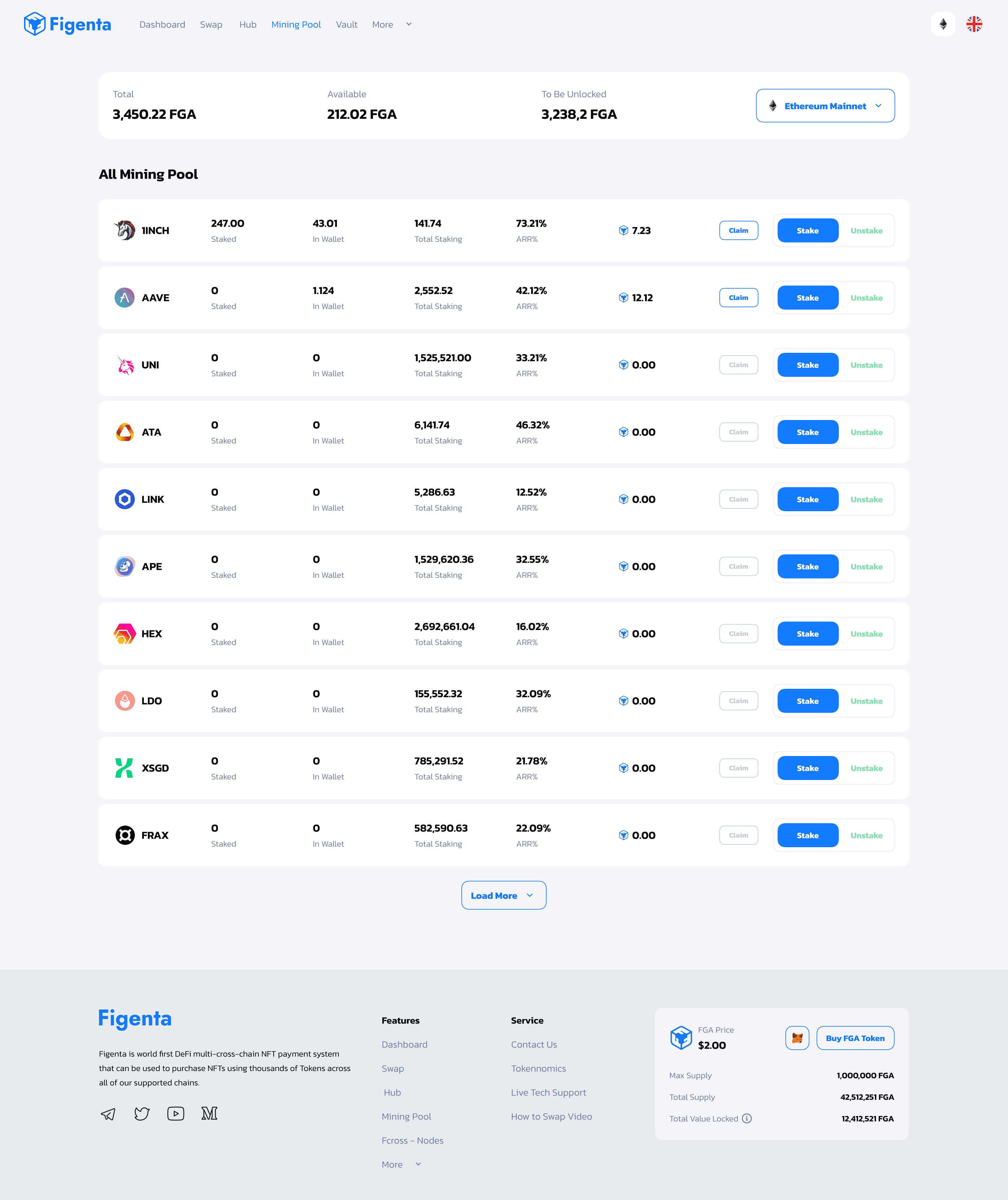
💰 4. Mining Pools (Staking UX)
Displayed top pools like 1INCH, AAVE, ATA with:
Total staking
APR %
Direct CTA (“Stake”)
Example values used:
1INCH — 73.21% APR
ATA — 46.32% APR
UX Improvements
Reward breakdown tooltips
APR explanation modal
Visual token logos for quick scanning
💰 4. Mining Pools (Staking UX)
Displayed top pools like 1INCH, AAVE, ATA with:
Total staking
APR %
Direct CTA (“Stake”)
Example values used:
1INCH — 73.21% APR
ATA — 46.32% APR
UX Improvements
Reward breakdown tooltips
APR explanation modal
Visual token logos for quick scanning
📊 2. Liquidity & Volume Charts
Charts show data across Day / Week / Month / Year with clean axis scaling.
Design Features:
Smooth multi-period transitions
Candlestick-inspired line charts
Always-on hover tooltips
Clear value ranges (e.g., $0B–$5B)
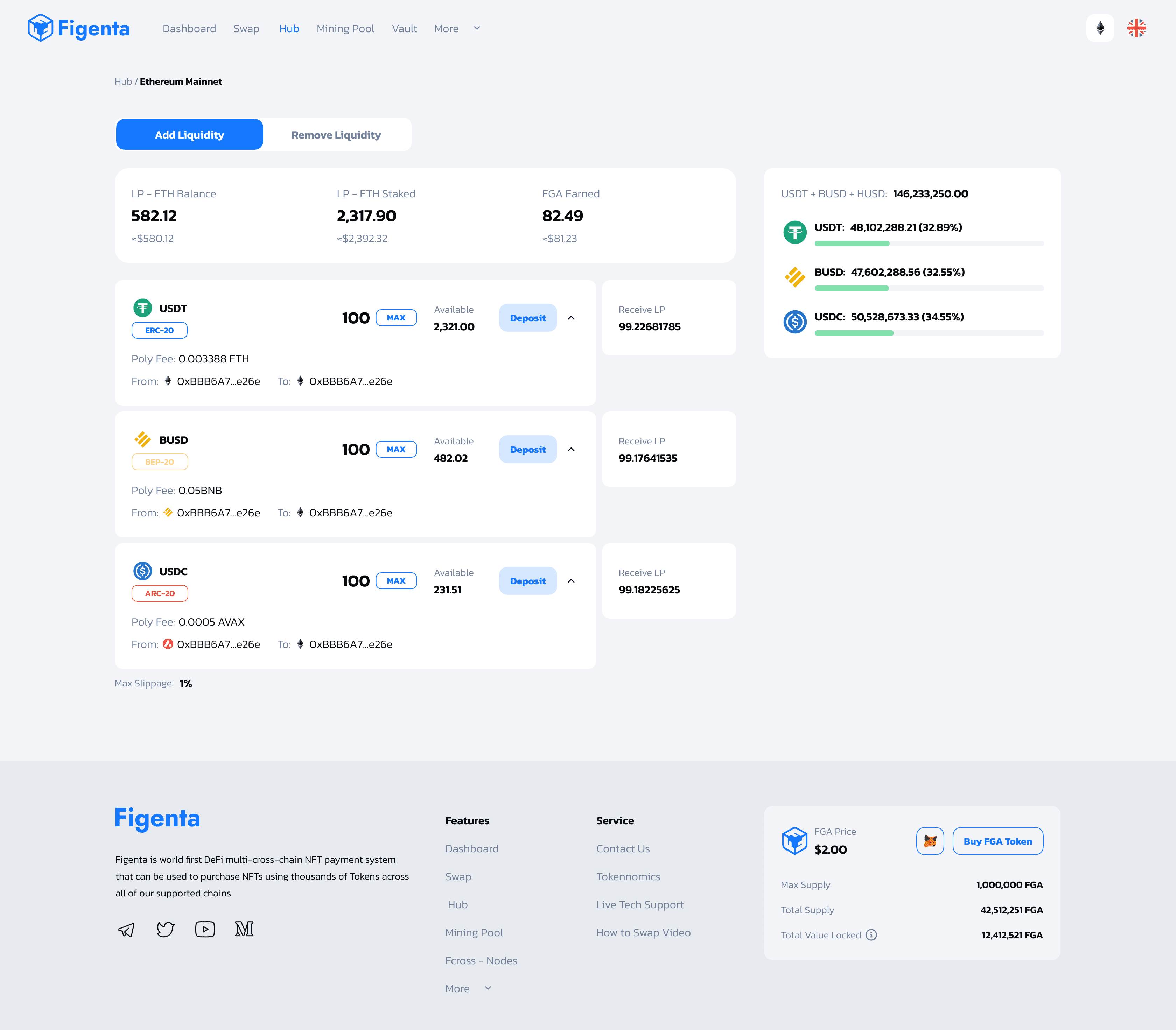
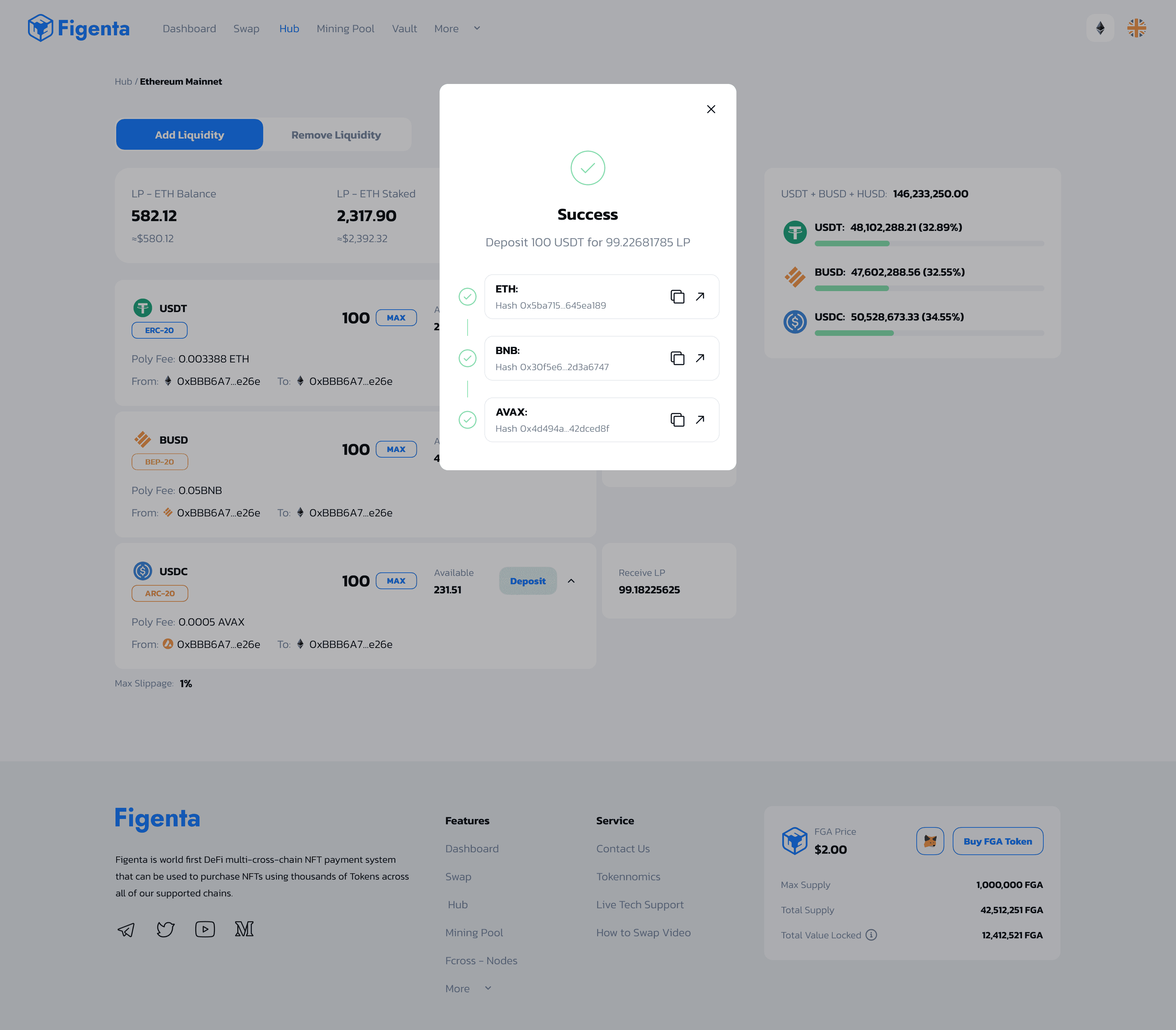
🔗 5. Multi-Cross-Chain Hub
This was the most complex section — the hub serves as a bridge across chains.
UX Challenges
Showing cross-chain compatibility
Communicating transfer fees
Presenting 24h volume per chain in a familiar, exchange-like format
UX Solutions
Introduced chain-branded color patterns
Added subtle hover micro-interactions
Designed a flow where chain switching never reloads the page
💰 4. Mining Pools (Staking UX)
Displayed top pools like 1INCH, AAVE, ATA with:
Total staking
APR %
Direct CTA (“Stake”)
Example values used:
1INCH — 73.21% APR
ATA — 46.32% APR
UX Improvements
Reward breakdown tooltips
APR explanation modal
Visual token logos for quick scanning
🔗 5. Multi-Cross-Chain Hub
This was the most complex section — the hub serves as a bridge across chains.
UX Challenges
Showing cross-chain compatibility
Communicating transfer fees
Presenting 24h volume per chain in a familiar, exchange-like format
UX Solutions
Introduced chain-branded color patterns
Added subtle hover micro-interactions
Designed a flow where chain switching never reloads the page
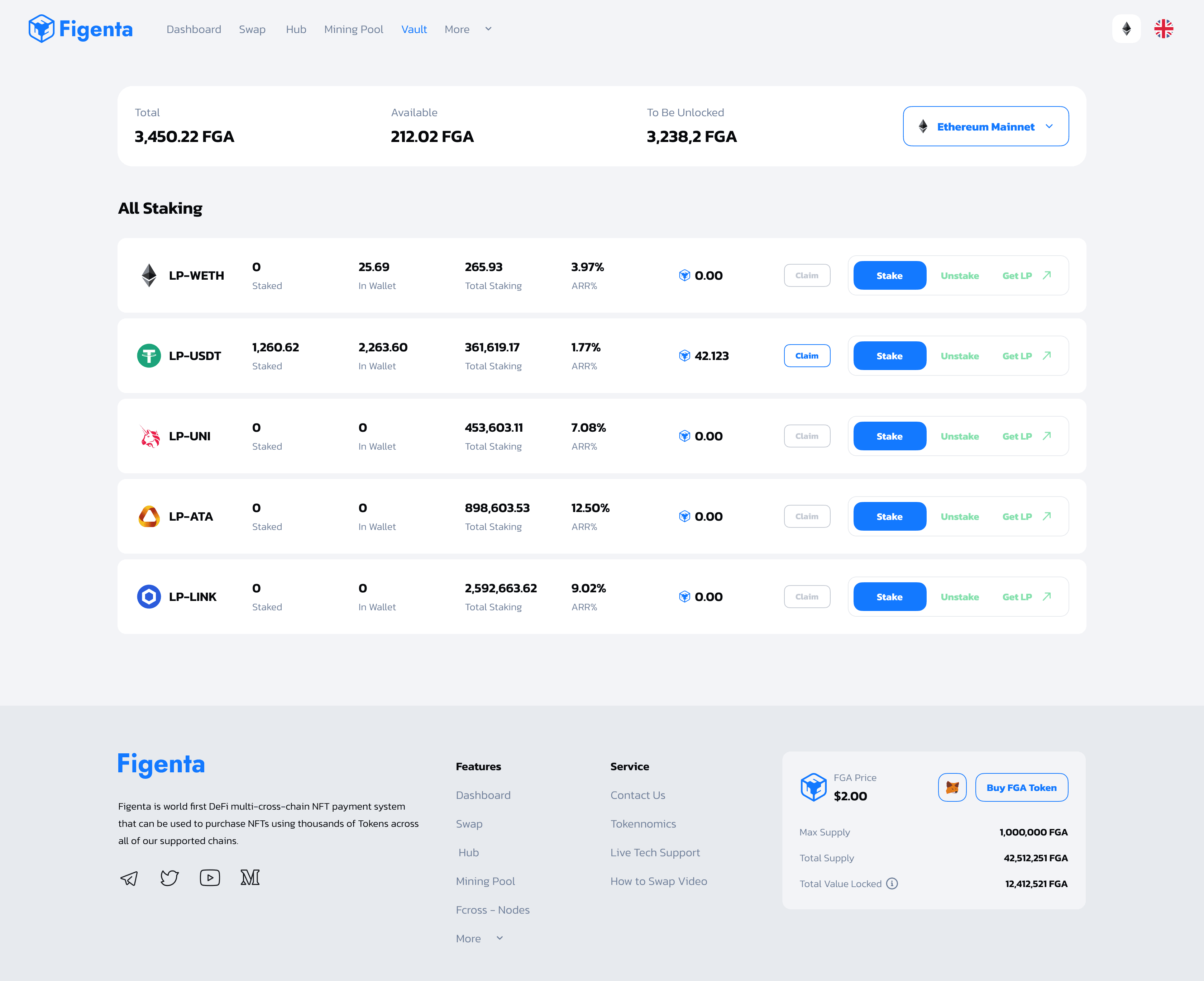
🧮 6. Tokenomics Page
Token usage, supply, and liquidity visuals were displayed using:
Supply bars
Price history chart
Liquidity distribution
Token growth trend (e.g. 34.65% price change)
This required translating heavy blockchain data into simple UI components.
🧮 6. Tokenomics Page
Token usage, supply, and liquidity visuals were displayed using:
Supply bars
Price history chart
Liquidity distribution
Token growth trend (e.g. 34.65% price change)
This required translating heavy blockchain data into simple UI components.
🧮 6. Tokenomics Page
Token usage, supply, and liquidity visuals were displayed using:
Supply bars
Price history chart
Liquidity distribution
Token growth trend (e.g. 34.65% price change)
This required translating heavy blockchain data into simple UI components.
♿ Accessibility Considerations
♿ Accessibility Considerations
♿ Accessibility Considerations
Despite the complexity of DeFi data, I ensured:
WCAG AA color contrast
Large tap targets for mobile staking actions
Icon + label pairing for all important data
Keyboard-friendly table navigation
Supports screen readers on pool tables
Despite the complexity of DeFi data, I ensured:
WCAG AA color contrast
Large tap targets for mobile staking actions
Icon + label pairing for all important data
Keyboard-friendly table navigation
Supports screen readers on pool tables
Despite the complexity of DeFi data, I ensured:
WCAG AA color contrast
Large tap targets for mobile staking actions
Icon + label pairing for all important data
Keyboard-friendly table navigation
Supports screen readers on pool tables
🧪 Usability Testing & Feedback (Synthetic)
🧪 Usability Testing & Feedback (Synthetic)
🧪 Usability Testing & Feedback (Synthetic)
Tested the dashboard with 12 users (crypto beginners to experienced traders).
Findings:
Users loved the unified TVL + chain data in one place
Sorting APR was a “top priority” feature
Users struggled less with multi-chain switching compared to other DeFi apps
Staking flows became significantly simpler
🏁 Outcome & Impact
🏁 Outcome & Impact
🏁 Outcome & Impact
The redesigned Figenta platform created:
📌 1. A clear trading-style dashboard
Suitable for managing NFTs, tokens, cross-chain actions, and staking.
📌 2. Simplified multi-chain UX
A complex Web3 product feels intuitive even for beginners.
📌 3. Improved data clarity
Charts and tables transform raw blockchain data into clean visual insight.
📌 4. A scalable DeFi design system
Reusable components support rapid feature expansions.
More Works More Works

03
//FAQ
Concerns
Frequently
Asked Questions
01
What type of projects do you work on?
02
Which industries do you specialize in?
03
Do you design and develop from scratch or work with existing systems?
04
How long does a typical project take?
05
Can you handle both frontend and backend development?
06
Do you work with startups as well as established companies?
07
How can I get started working with you?
03
//FAQ
Concerns
Frequently
Asked Questions
01
What type of projects do you work on?
02
Which industries do you specialize in?
03
Do you design and develop from scratch or work with existing systems?
04
How long does a typical project take?
05
Can you handle both frontend and backend development?
06
Do you work with startups as well as established companies?
07
How can I get started working with you?
//FAQ
Concerns
Frequently
Asked Question
What type of projects do you work on?
Which industries do you specialize in?
Do you design and develop from scratch or work with existing systems?
How long does a typical project take?
Can you handle both frontend and backend development?
Do you work with startups as well as established companies?
How can I get started working with you?
03
//FAQ
Concerns
Frequently
Asked Questions
01
What type of projects do you work on?
02
Which industries do you specialize in?
03
Do you design and develop from scratch or work with existing systems?
04
How long does a typical project take?
05
Can you handle both frontend and backend development?
06
Do you work with startups as well as established companies?
07
How can I get started working with you?
Let'S WORK
TOGETHER
BASED IN WEST AFRICA,
AFRICA

PRODUCT Designer
+ Framer Developer
Based in WEST AFRICA, I’m a product designer and full-stack developer crafting intuitive, high-performance digital experiences. My work blends minimalist aesthetics, elegant typography, and modern web technologies to create designs that are as functional as they are beautiful.
Let'S WORK
TOGETHER
BASED IN WEST AFRICA,
AFRICA
PRODUCT Designer
+ Framer Developer
Based in WEST AFRICA, I’m a product designer and full-stack developer crafting intuitive, high-performance digital experiences. My work blends minimalist aesthetics, elegant typography, and modern web technologies to create designs that are as functional as they are beautiful.
Let'S WORK
TOGETHER
BASED IN africa, I AM AN INNOVATIVE DESIGNER AND DIGITAL ARTIST. MY PASSION FOR MINIMALIST AESTHETICS, ELEGANT TYPOGRAPHY, AND INTUITIVE DESIGN IS EVIDENT IN MY WORK.
Let'S WORK
TOGETHER
BASED IN WEST AFRICA,
AFRICA
PRODUCT Designer
+ Framer Developer